Most CPAP apps hand you one number, your AHI, and call it a day. That's like rating a movie by its runtime. Your night is thousands of data points, and once you can read them, you stop guessing about your therapy and start seeing it.
Here's the quick tour.
The night at a glance
The dashboard opens on your most recent night and the trends behind it: AHI, usage hours, leak, pressure, and your therapy mode, big and up top. It's the "am I okay?" glance before coffee. Underneath, every metric is already plotted over the last month, so a single rough night never looks like a crisis and a slow drift never hides.
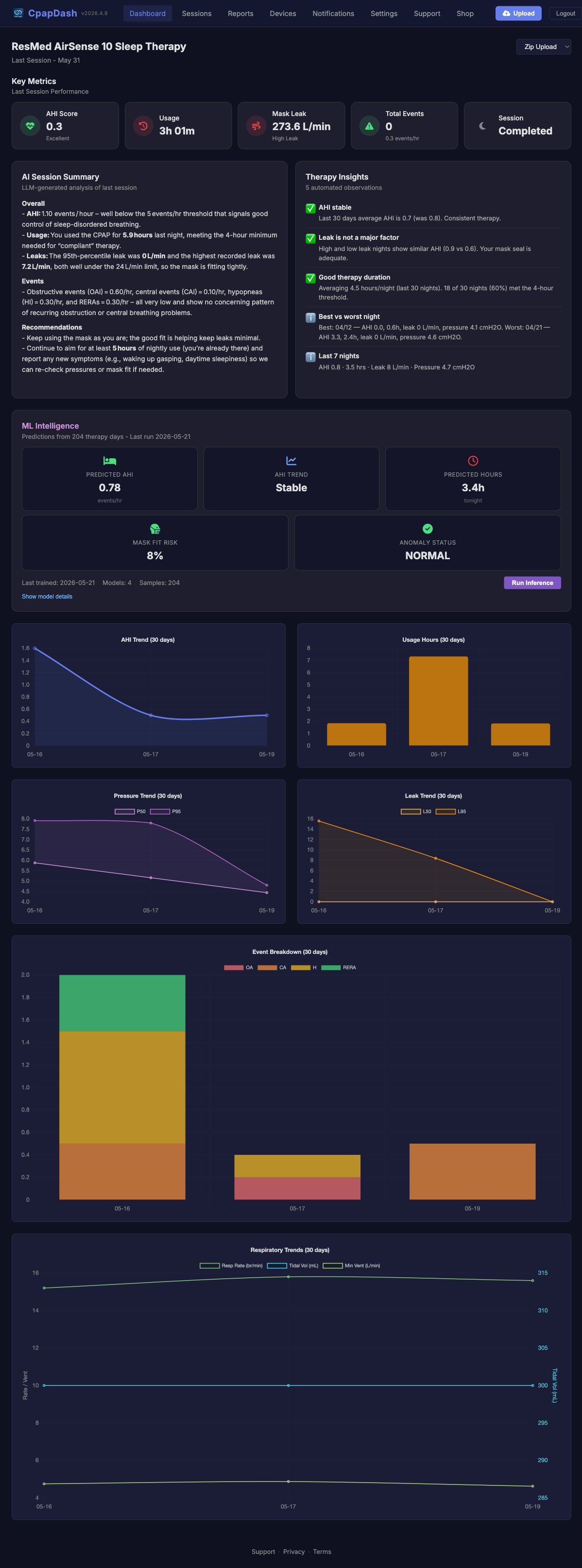
Green-ish numbers mean a normal night. The point isn't to chase a perfect score. It's to know what your normal looks like, so you notice when it moves.
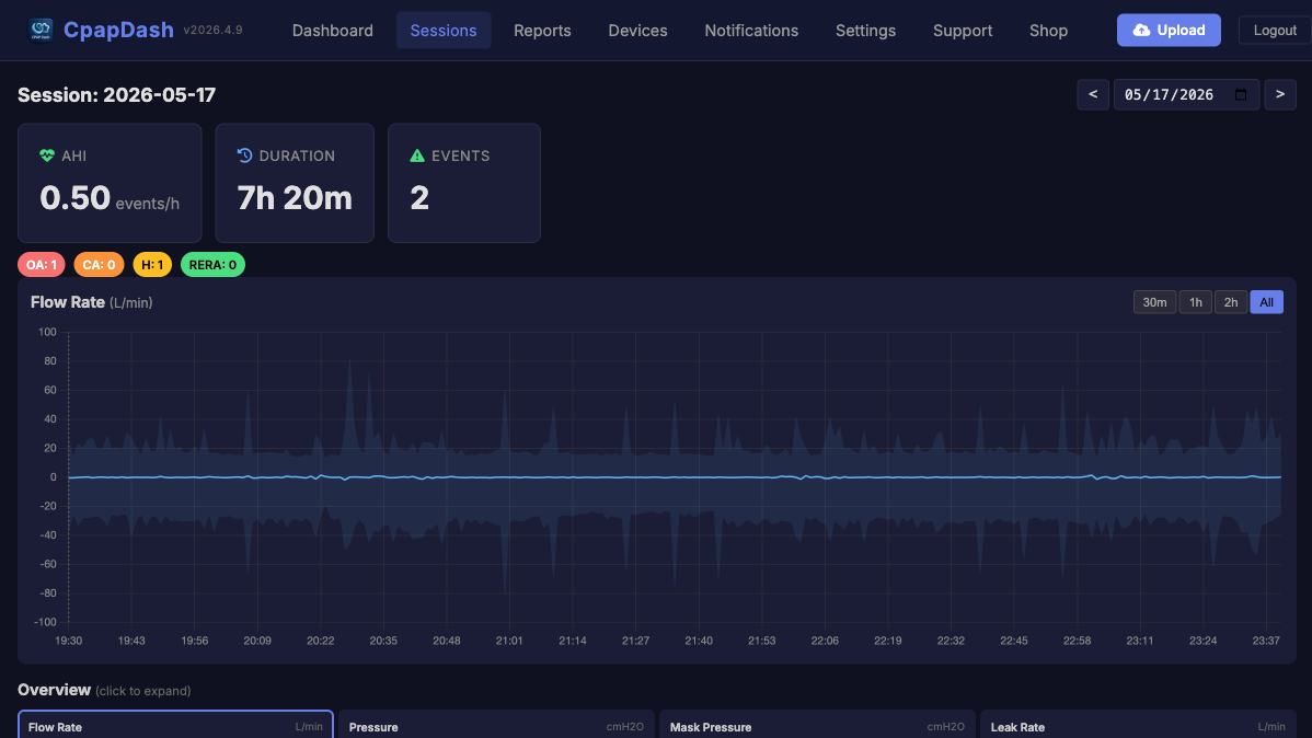
Go deeper: one night, every signal
Click into a night and the whole thing opens up. Not just how many apneas, but what kind and when:
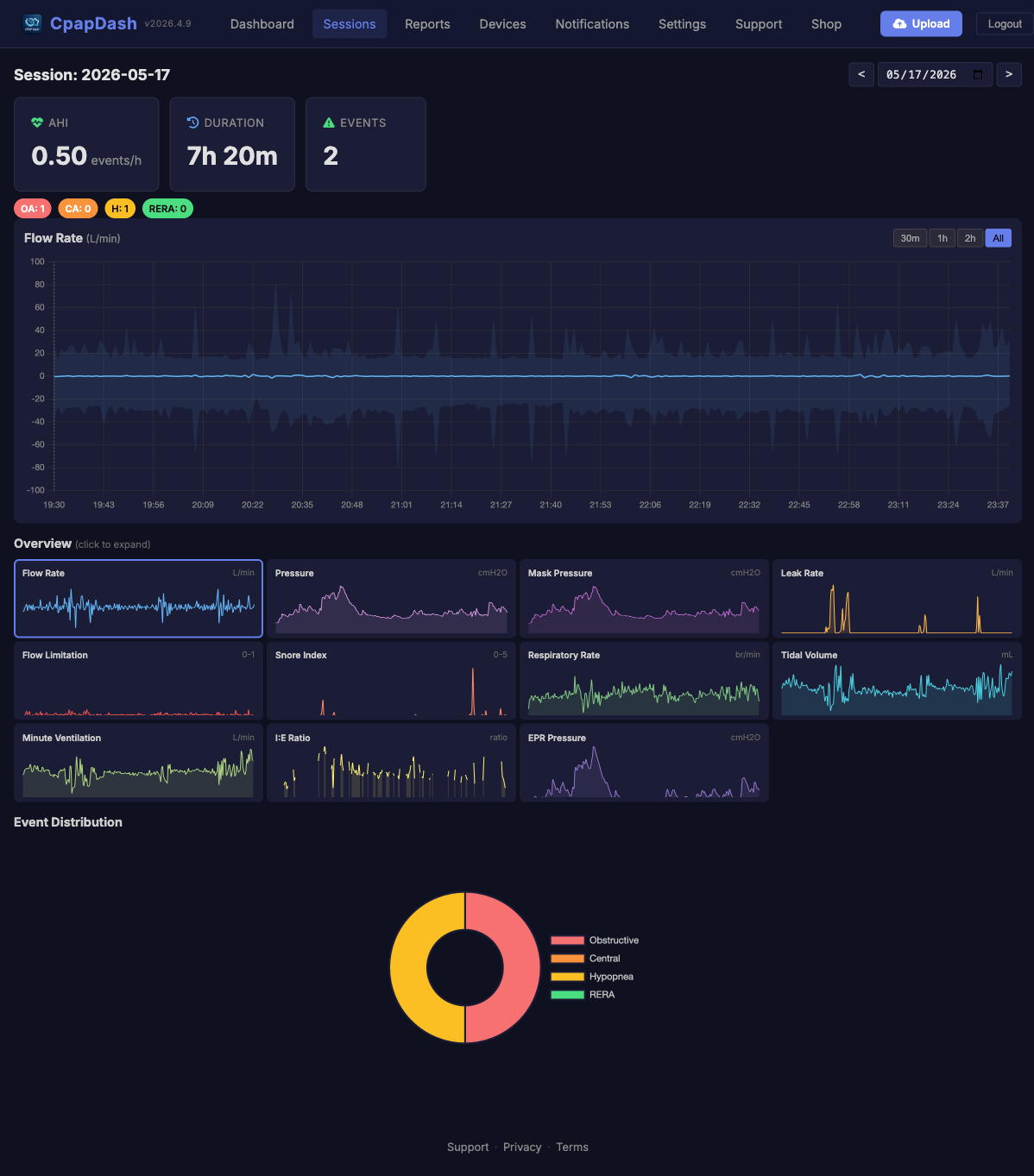
- Events. Obstructive, central, hypopnea, RERA, broken out and counted. A night of mostly central events tells a very different story than obstructive ones, and the donut shows the mix at a glance.
- Flow rate and pressure. What your machine actually delivered, not just what it's set to. You'll see it ramp, hold, and react. Zoom into any 30-minute window.
- Leak. Mask fit, basically. A spike usually means you rolled over and broke the seal.
- Breathing. Respiratory rate, tidal volume, minute ventilation, I:E ratio. The actual shape of your breathing, second by second.
- Oxygen. Pair a Wellue O2Ring and SpO₂ and heart rate ride right alongside the rest, with desaturations and your ODI called out, so you can line a drop in oxygen up against the event that caused it.
Let the app read it for you
New: CpapDash now writes the night up in plain English. The Session Summary turns those charts into sentences ("leak well under the limit, mask fitting tightly; events very low, no concerning pattern"). Therapy Insights surfaces a handful of automated observations across your last 30 days. And ML Intelligence forecasts where your AHI is trending. It's the difference between having your data and understanding it, without needing a sleep-medicine degree.
Trends are where it clicks
One night is a snapshot. The trend lines are the story. AHI drifting up over two weeks? Leak creeping after you changed cushions? Usage slipping on weekends? That's the stuff a single night hides and a trend makes obvious, and it's right there on the dashboard, no digging.
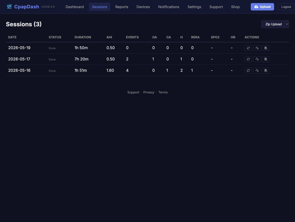
Every night, in a list
Want the raw log? The sessions table is every night you've recorded: date, AHI, duration, the event counts, oxygen if you have it. It's sortable, and one click from the full detail view.
And it's all free
The whole viewer (dashboard, sessions, trends, statistics, PDF reports) is free, forever. We don't put a paywall between you and your own data. The paid tier is about interpretation (the AI summaries and insights above), not access.
Poke around. The fastest way to learn what's normal for you is to look at a few good nights and a few rough ones back to back.